A visual road
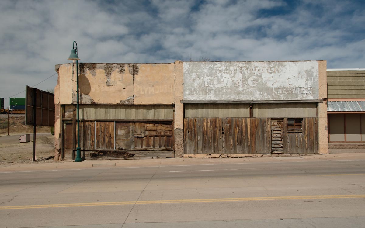
Route 66 is a dream for visual people because it was built to be noticed. Signs had to compete with speed. Buildings had to announce themselves from the roadside. Motels used shape, colour and light to promise comfort. Diners used chrome, curves, lettering and mascots to become memorable. Even decay has a visual language here: peeling paint, sun-bleached colour, ghost signs, rust, cracked asphalt and desert shadows.
Lettering and signage
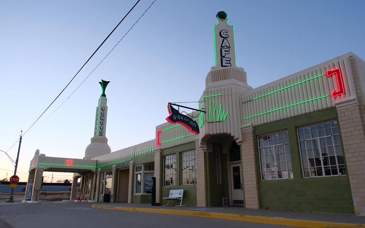
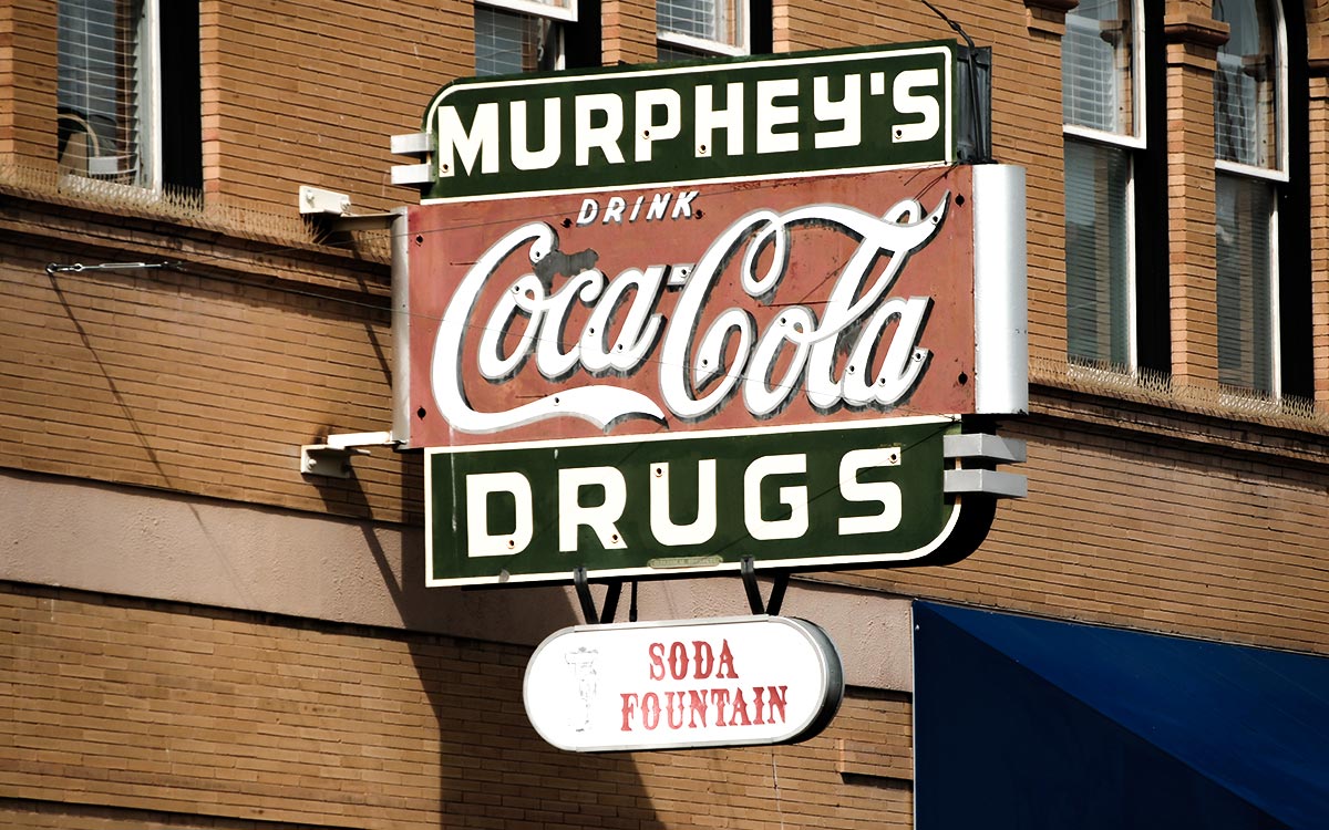
Pay attention to lettering. Route 66 is full of scripts, block letters, arrows, shields, stars, hand-painted panels, bulb signs, neon tubes and mid-century type. Some signs are beautifully restored; others are barely hanging on. Photograph the whole sign, then photograph the details: the mounting, the shadows, the repairs, the mismatched paint, the way the letters sit against the sky.
Colour
The road has several colour palettes. Illinois can feel brick, cream, red and green. Missouri adds stone, forest and diner chrome. Texas gives you faded reds, cattle browns and big-sky blue. New Mexico brings turquoise, adobe, coral, desert gold and neon. Arizona shifts into rust, sand, pine, asphalt and painted signage. California adds Mojave beige, sunburnt white, motel blue, old red and Pacific haze. Designers should record these palettes by state, not flatten the road into one retro cliché.
Composition
Classic Route 66 compositions use depth: road leading lines, signs against sky, motels in perspective, gas pumps in the foreground, mountains or desert behind. But do not only shoot the obvious wide view. Shoot the menu typography, the door handles, the room numbers, the postcards, the asphalt texture, the faded window decals, the way a neon sign reflects on a parked car.
Morning and evening
Midday can be harsh, especially in the west. Early morning gives you empty streets, soft light and quiet signs. Evening gives you neon, long shadows and atmosphere. If you care about photography, plan your days around light. The best shot may require staying overnight rather than passing through.
People and permission
The road is not only objects. Photograph people respectfully. Ask before making someone the subject. Business owners, museum volunteers, mechanics, cooks and motel hosts are part of the story. A portrait with permission and a name will matter more than another anonymous sign.
Avoid visual laziness
It is easy to make Route 66 look like a costume: oversaturated neon, fake nostalgia, the same shield repeated everywhere. The more interesting approach is to show contrast. New cars beside old signs. Solar panels near vintage motels. Closed businesses beside restored ones. Tourists taking selfies while locals go to work. Route 66 is visually rich because the past and present keep colliding.
Why visual people love Route 66
Route 66 is almost a design archive disguised as a road trip. It contains hand-lettering, neon typography, painted signs, mascots, vernacular architecture, diner interiors, motel colour palettes, gas station geometry, murals, souvenir graphics, postcards, maps and mid-century optimism. It also contains weathering, repairs, mismatched additions and beautiful failures.
The route's visual language came from function. Signs had to be legible from a moving car. Buildings had to announce food, fuel or sleep quickly. Novelty shapes helped small businesses compete before search engines and rating platforms. That is why an arrow, a cowboy, a giant whale, a tilted sign or a glowing vacancy board can feel more memorable than a polished brand identity.
Dates and styles to watch for
Look for 1920s and 1930s infrastructure, Art Deco and streamline details, post-war motel forms, 1950s and 1960s neon, atomic-era shapes, hand-painted murals and later preservation-era recreations. Not everything old-looking is old, and not everything new is fake. Some modern signs are deliberate acts of continuity.
For designers and photographers, the honest challenge is restraint. Route 66 is visually loud, but the best images often show context: a sign against a plain sky, a motel office with the rooms behind it, a gas pump in relation to the canopy, or a giant figure scaled against the road. The story lives in proportion.
Take it with you in Route 66 Logbook
Route 66 Logbook can become part of your visual record. Save the locations you photograph, note the light or detail that caught your eye, and build a trail of signs, motels, murals, road fragments and small visual discoveries rather than relying only on your camera roll to remember where everything was.
Photograph the context, not just the sign
For designers, Route 66 is a lesson in visibility. Many signs were not designed for a static viewer. They were designed to be read quickly from a moving car, often at an angle, in changing light. That requirement created bold silhouettes, high contrast and memorable forms.
Return when the light changes
Make colour notes in context. A turquoise sign in New Mexico does not feel the same as turquoise on a screen. It sits against dust, adobe, sky and sun-faded paint. The environment is part of the palette. Photograph wide enough to remember that relationship.
Make a visual record of the whole road
The most interesting visual archive includes failures too: bad repairs, mismatched fonts, faded vinyl, awkward additions, signs partly hidden by new development. Those imperfections show how places adapt over time. For a brand or app project, they may be more inspiring than the perfect postcard view.